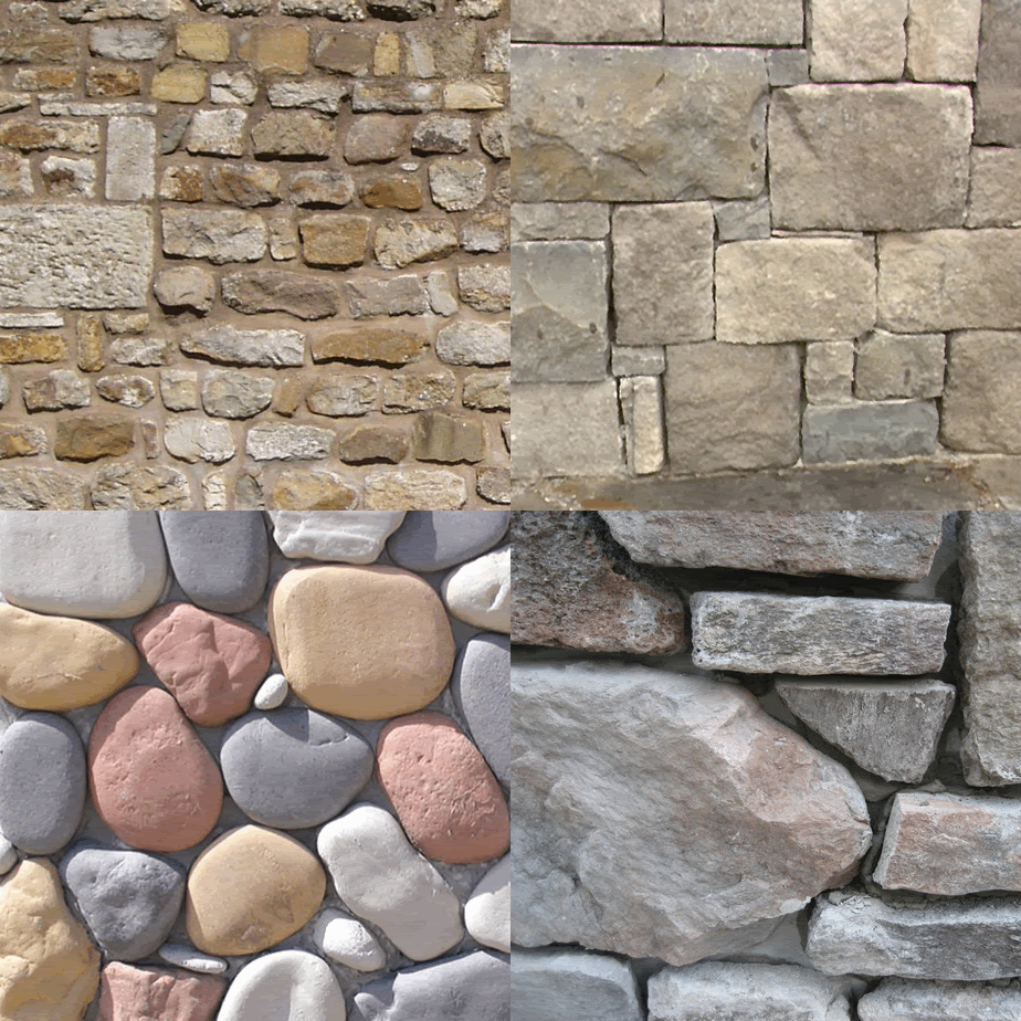
stone is wonderful and versatile design element for commercial buildings, residences and their gardens: it can be modern or ancient, rough or smooth, big or small, or any combination of those attributes. i love stone! so when i saw the wall below, i just had to say something...something like "what the hell were you thinking? or doing at the time of installation?" how can something made from beautiful parts end up so ugly? i dont know, but this stone guy has done this same lame stone wall on three main street buildings...and he puts a sign out front to tell everyone the name of the company that installed this travesty of design and execution! the worst part about this particular wall is there is a "matching" stone wall flanking the other side of the door, except he used too many stones on that one, thus leaving this side wanting for more. please dont try this at home: so sad!
Wednesday, June 9, 2010
how not to install a stone wall
Labels:
architecture,
bad design,
design,
faux stone,
masonry walls,
stone,
stone veneer walls,
stone walls,
stone work
Subscribe to:
Post Comments (Atom)


No comments:
Post a Comment